
Skincare & Wellness Visual Identity
Garden City Essentials
Overview
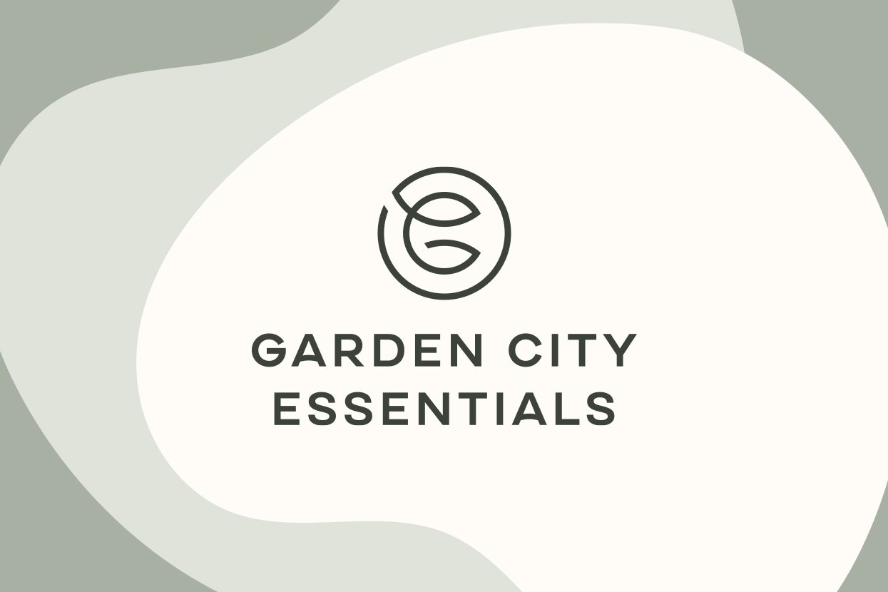
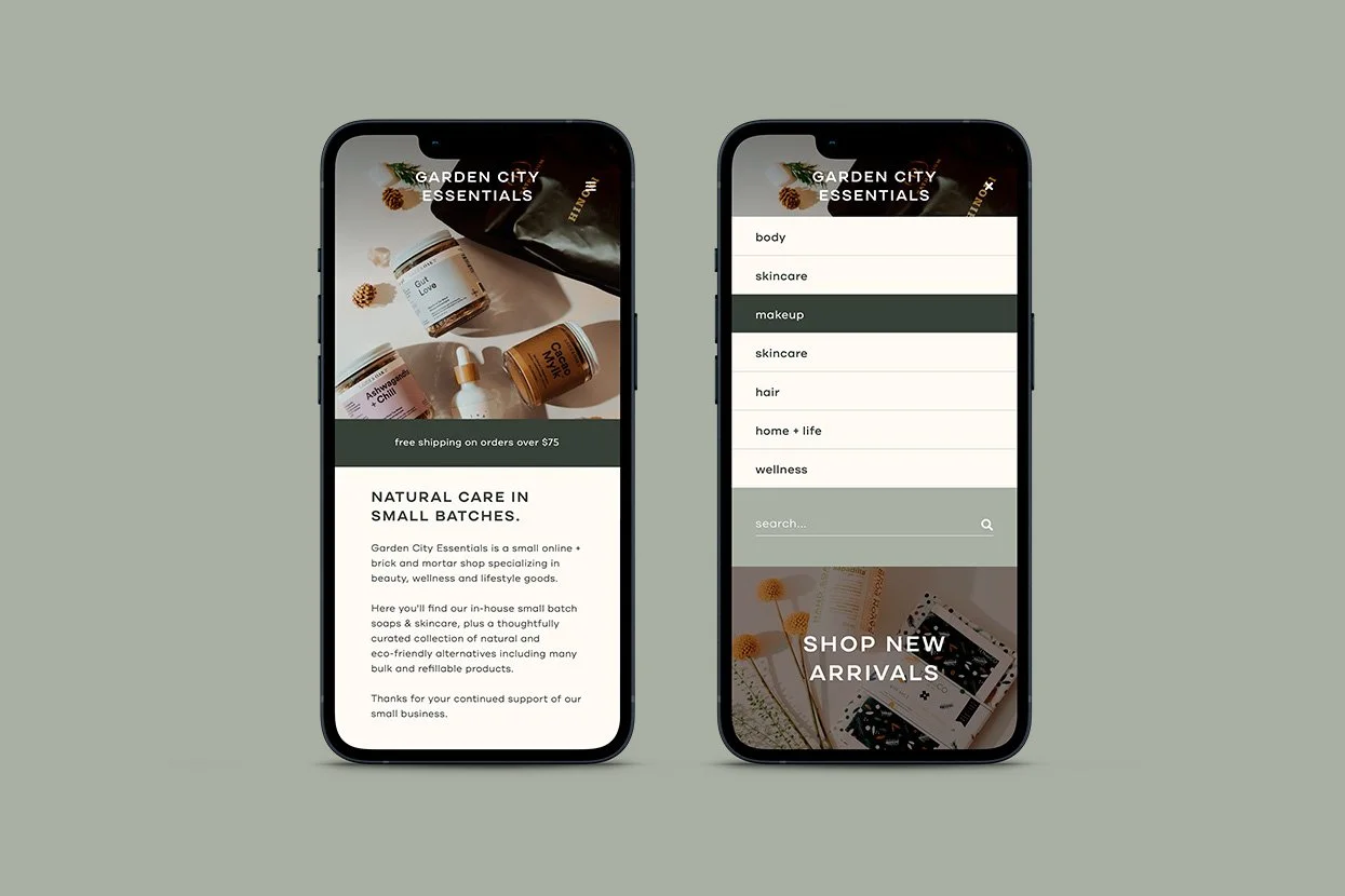
Garden City Essentials is an eco-friendly shop that offers small batch beauty and lifestyle goods. On their 5th anniversary, they asked me to elevate the brand's visual identity to reflect its sophistication and expertise. The new logo features a GCE monogram and leaf shapes, symbolizing its history and core competencies. A single continuous stroke enclosed in a circle represents harmony, handmade products, comfort, and care. The logotype is a complementary modern sans-serif typeface. The result is a more sophisticated and mature brand aesthetic that reflects its reputation in the natural care space, and is prepared to thrive for the next 5 years and beyond.
SERVICES
Creative Direction
Visual Identity Design
Logo Redesign
Signage
Packaging
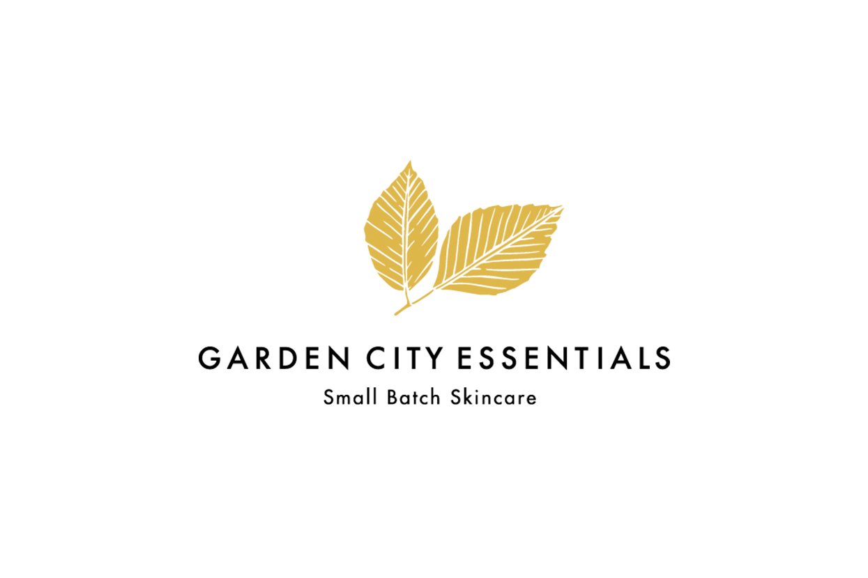
Before & After


“It was a pleasure working with Jordan. From our discovery call to the final presentation, the thought and care he put into his work was clear. Jordan is a talented designer, and his process and presentation skills are impeccable! He guided the experience effortlessly, and the outcome far exceeded my expectations - I felt so seen as the brand identity was revealed.”
Jolene Antle
Garden City Essentials
Let’s talk about skincare branding.
Do you need a logo design for your skincare products? Let’s have a conversation about your vision, and craft it into something tangible. Click the button below to get in touch.